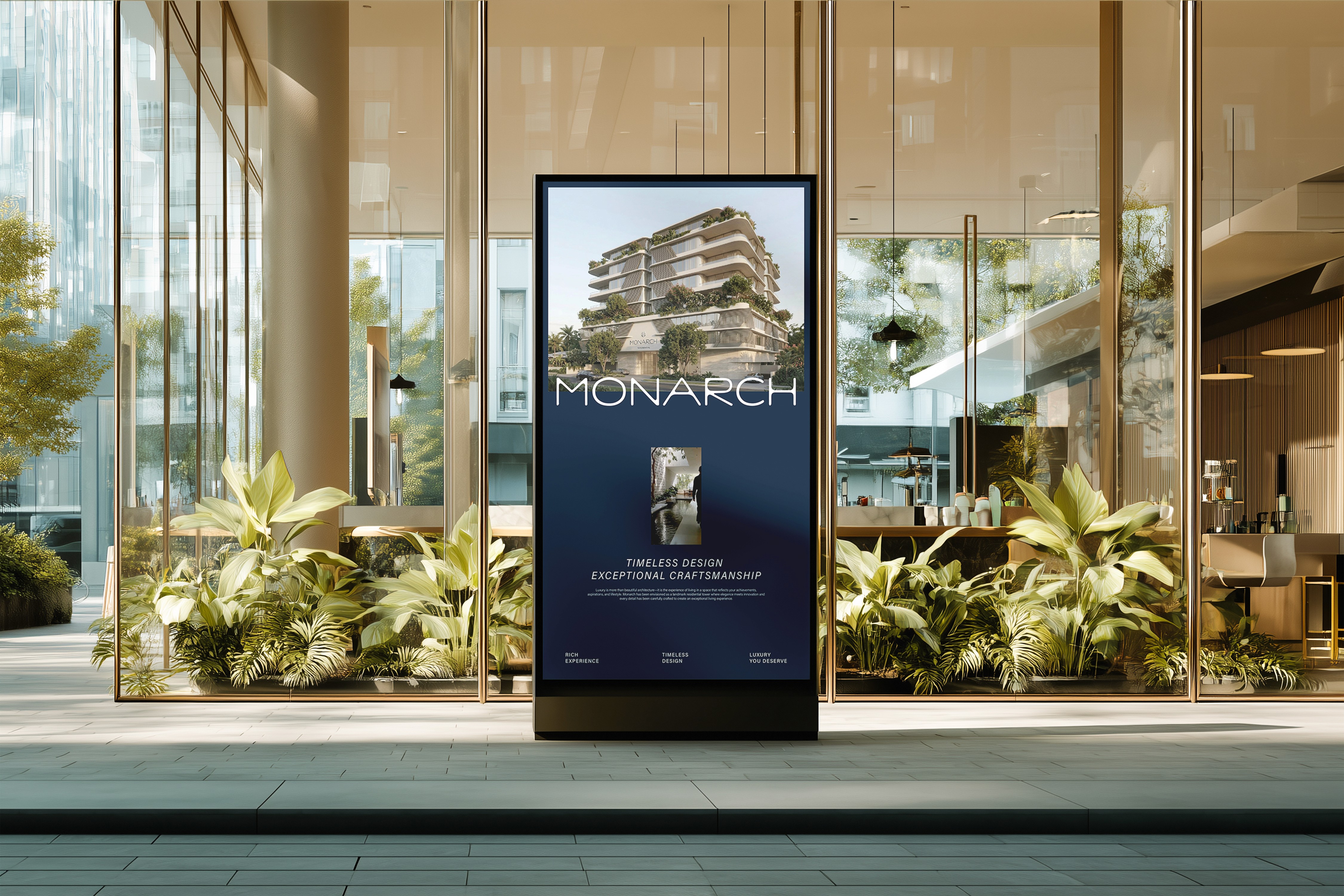
Monarch
Every element chosen with intention. Every detail built to position Monarch exactly where it belongs — above the market.
Demanded more than a logo. It demanded a visual language that makes a buyer feel they've already arrived — before they step through the door.
(Research)
Understanding the market position, the buyer profile, and the competitive landscape. Every brand decision rooted in what the right client needs to feel — not just see.
(Experiment)
Testing the visual language against the brand's ambition. Color, typography, mark — refined until every element feels inevitable. Nothing arbitrary. Nothing decorative.
(Results)
Client Satisfaction
100%
Brand Impact
Permanent


